Year : 2023

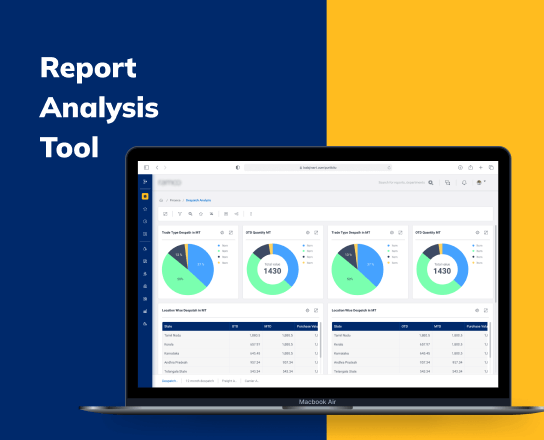
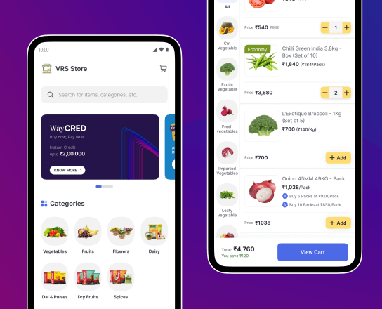
Building a design system for 15+ Agri-supply chain SaaS products

Censa Logo

Agri-supply chain SaaS products

Short version

⚠️

Problem

15+ products, fragmented teams, inconsistent and inefficient workflow, up to 50% loss in design to dev conversion and limited scalability

🤔

Key Decisions

Cross functional alignment, future proofing with design tokens, multi-brand vision, rebuilt the design + dev relationship and efficiency design system management

🚀

Impact

85% design to dev conversion, accelerated time-to-market across teams, revamped 15+ products in just 3 months, 25% jump in user satisfaction after roll-out

👨🏻‍💻

My Role

Co-led the design system and drove the above decisions along with 2 other core DS designers

Censa carousal image 1 Censa carousal image 2 Censa carousal image 3 Censa carousal image 4 Censa carousal image 1 duplicate Censa carousal image 2 duplicate Censa carousal image 3 duplicate Censa carousal image 4 duplicate

Context & problem

Long version

Censa’s farm-to-fork SaaS suite spans more than 15 applications that cover every stage of the agri-supply chain. Over time, each product evolved in relative isolation to meet its own release pressures and stakeholder demands, resulting in a unique set of personas, multiple visual style variants, and siloed design teams duplicating effort across isolated files.

What began as a flexible workflow eventually exposed its limits and developers were rewriting UI code from scratch for every new feature. The absence of a shared library created avoidable defects, inconsistent brand perception, and unpredictable delivery timelines. This signals that a unified design system is a critical requirement to scale both quality and speed.

15+
Applications

An extensive digital ecosystem

23
Unique user personas

Diverse user base in agri-supply chain.

50% 🔻
Loss in Design-to-Development
7
Unique styles

Visual inconsistency across platforms

Team structure and my role

I'm here

Core team

1 Lead Product Designer

Owned system architecture, governance and facilitated cross functional collaboration

3 Core Product Designer

Focused on building, maintaining and documenting figma library + storybook components

Core product designers icon

11 Product Designer

Applied the system in live products and contributed use-case feedback

2 UX Researchers

Validated design hypotheses, guided usability testing, and ensured user-centric decision making across the system

Cross funtional team

Product Managers

Ensured roadmap alignment and prioritized areas for system rollout based on product need and business goals

Engineering Managers

Collaborated closely on integrating the design system into Storybook and aligning coded components with Figma

Business Stakeholders

Played a key role in resource planning and leadership buy-in, helping position the system as a business enabler

Our approach to building it

From day one we followed a research-led, iterative process that prioritised clarity, performance, and accessibility—principles that could scale with Censa’s global ambitions.

Foundation through research

Our research team was embedded end-to-end. They

Design system architecture

Unified Visual Language

With such a wide range of users across the supply-chain suite, we needed a single visual language that felt universal yet unmistakably “Censa.” Our goal was clarity and function—interfaces that looked cohesive and supported any workflow.

  • Consolidated core foundations—typography, colour, spacing, iconography
  • Standardised UI expression across dashboards, workflows, and transactional tools
  • Balanced system-level consistency with component-level flexibility for edge use-cases

Scalable Design Tokens

To drive consistency at scale, we adopted design tokens as the backbone of the system. Tokens codified every visual property—colour, typography, spacing—so updates propagate instantly across all interfaces. This single source of truth streamlined design-to-dev hand-offs and future-proofed the platform for new themes and product expansions.

Token structure

The naming of our design tokens was structured hierarchically to maximize clarity and meaning for both the design and development teams. This systematic approach ensures that each token’s purpose and application are immediately clear, facilitating smoother communication and more efficient workflow.

Token structure infographics

Future proof

Our design tokens are crafted for longevity and adaptability, allowing for easy updates or expansions as needs evolve. By simply reassigning core tokens, new styles can be swiftly implemented, ensuring our design system remains dynamic and future-proof.

Token modification infographics

Modular components

We built a comprehensive library of reusable Figma components to serve complex, data-heavy workflows across the suite. Each component uses clear variants and properties so teams can assemble screens quickly without reinventing patterns.

Driving adoption

Build in Code (Storybook as the bridge)

We built a React component library in Storybook, alongside the Figma system, so design and engineering could review the same behaviors. Storybook entries documented props, variants, and usage guidelines, which enabled real-time alignment and faster reviews. With code and design moving in lockstep, we achieved 85%+ design-to-dev parity across production teams.

Storybooks

Decide with Evidence: Principle-Driven A/B Testing

We A/B tested key variables, layout variants, colour pairings, and information hierarchy using heat-maps, surveys, and task completion metrics to choose the winners. From this work we finalised three system principles:

  • Clarity over cleverness
  • Performance through consistency
  • Modularity without rigidity

Rollout & Continuous Adoption

With the foundations in place, Storybook became the developer-ready source of truth where teams could view, test, and implement components directly in code. Versioned releases, change logs, and concise do/don’t guidance supported ongoing adoption across teams.

Outcomes & learnings

Shipping the design system wasn’t the finish line. Success meant teams could build faster with fewer gaps, and users experienced a consistent, high-quality product across the suite.

Impact

85% +
Design-to-dev parity

across production teams, driven by Storybook and token alignment

25%
Increase in user satisfaction

based on post-rollout surveys and feedback

3
Months to revamp all 15+ applications

unifying the visual language across the suite

Fewer errors and rework

thanks to complete states and clearer specs

How we made adoption stick

What we learned

Thanks for reading!

Other case studies

Waycool Logo

Waycool app

B2B Commerce: Crafting an Intuitive Ecommerce App for Groceries, Vegetables, and Beyond

Seamless Ordering, Fresh Ingredients, and Unmatched Convenience for Grocery Stores, Hotels, Restaurants, Supermarkets, and Hypermarkets

Ramco cements logo

Ramco Cements

Streamlining Data Insights: Developing a Report Analysis System for Cement Production Company

Designed a report analysis application for one of the top cement manufactures in India.