Year : 2023

Streamlining multi-vendor Purchase Orders for procurement efficiency

Censa Logo

Procurement App

Short version

⚠️

Problem

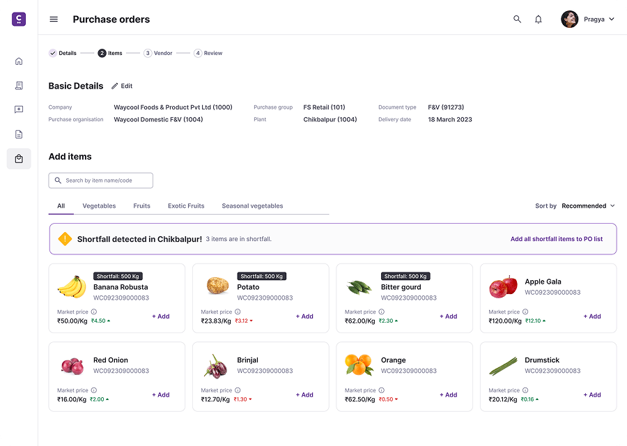
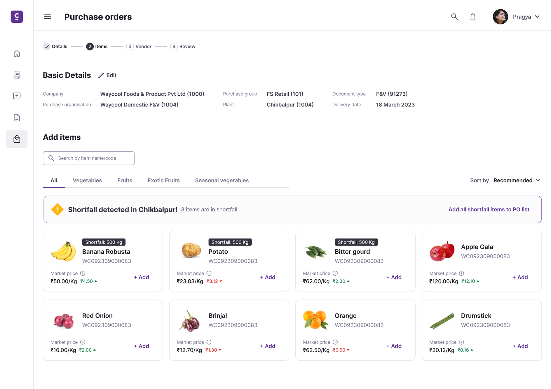
Procurement officers could create purchase orders for only one vendor at a time, making bulk ordering slow, repetitive, and error-prone.

🤔

Key Decisions

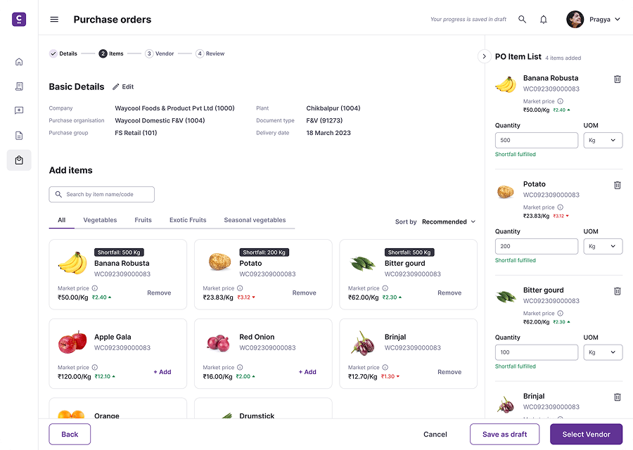
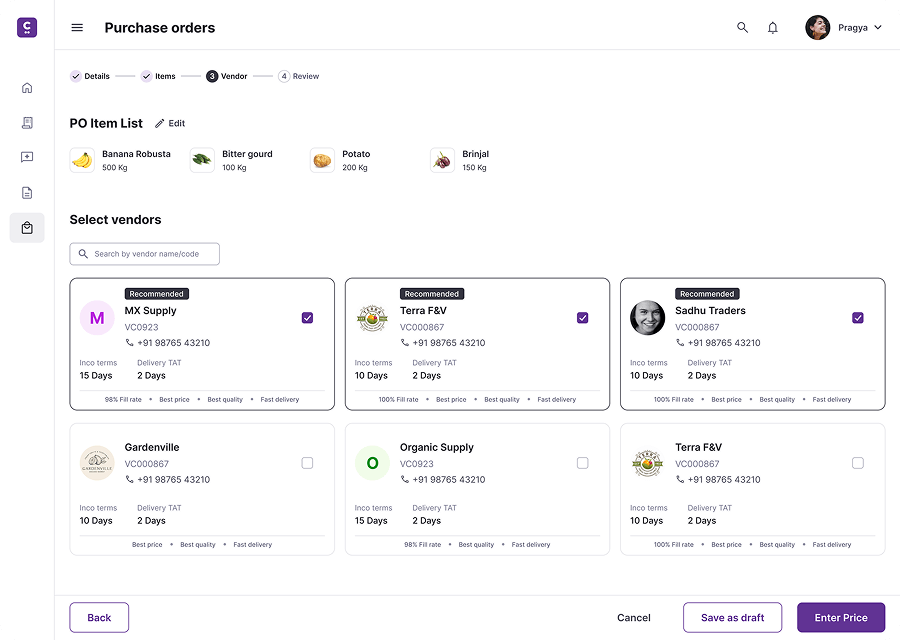
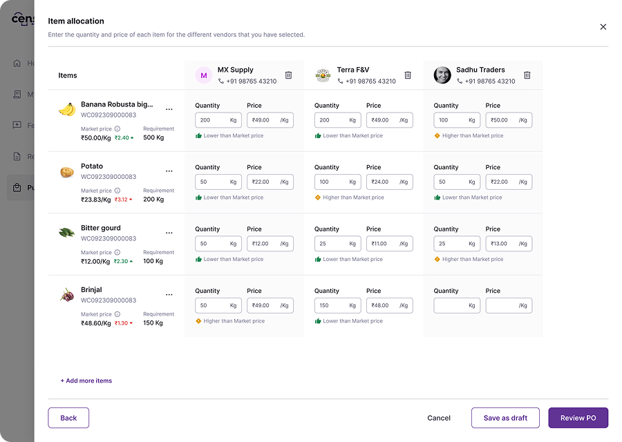
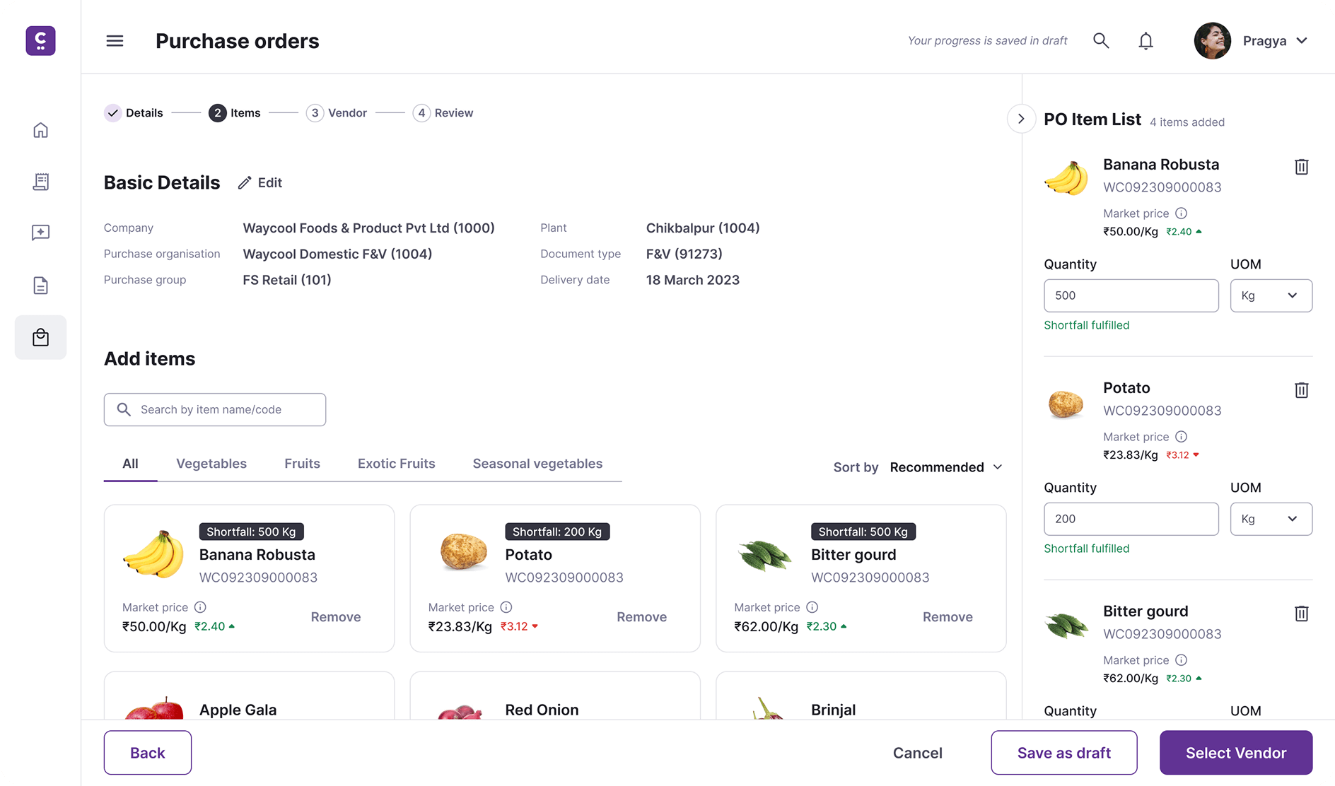
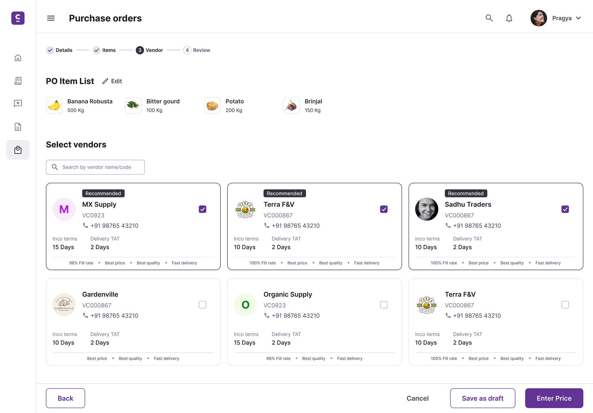
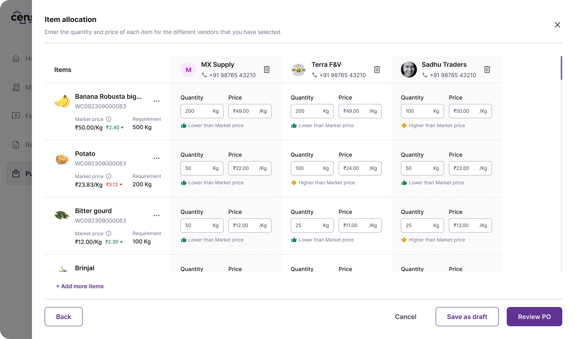
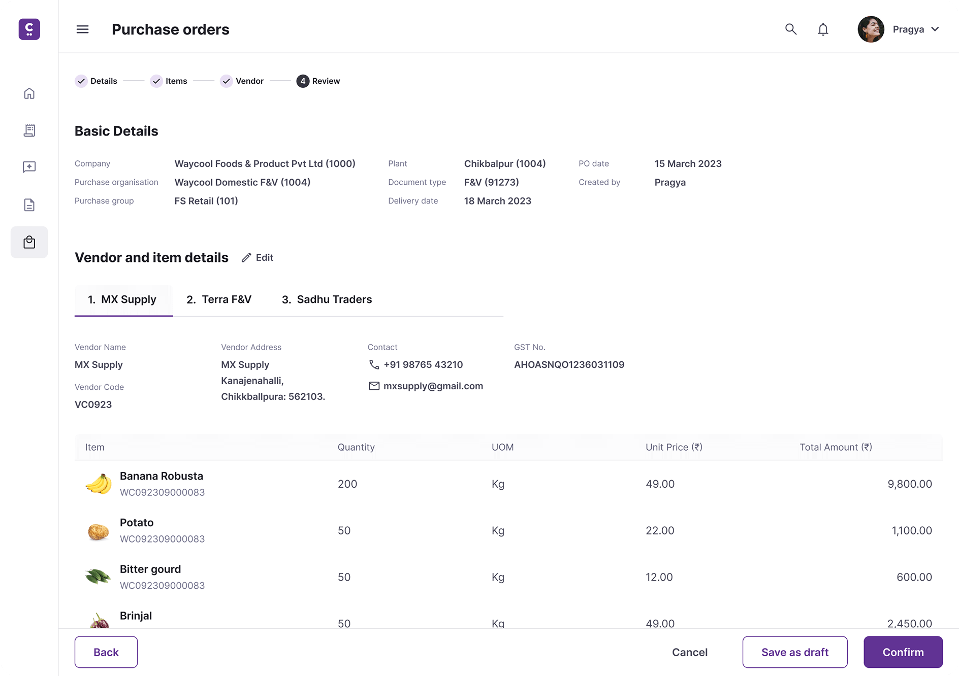
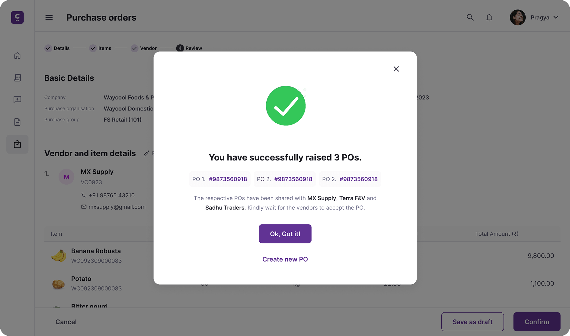
Redesigned the workflow to handle multiple vendors in a single session. Added a smart item-splitting interface and batch review screen to simplify allocation and confirmation.

🚀

Impact

Reduced purchase order creation time by ~60% and improved data accuracy. The new flow replaced the old single-vendor process across teams.

👨🏻‍💻

My Role

Handled end-to-end design, from mapping pain points and prototyping in Figma to validating with procurement officers and collaborating with PMs and developers for delivery.

censa PO carousal image 1 censa PO carousal image 2 censa PO carousal image 3 censa PO carousal image 4 censa PO carousal image 1 duplicate censa PO carousal image 2 duplicate censa PO carousal image 3 duplicate censa PO carousal image 4 duplicate

Context & problem

Long version

Waycool Foods, one of India’s largest agri-tech supply chain companies, partnered with CensaNext to build internal digital solutions that streamline complex procurement and logistics workflows. Among these tools was a procurement web application used daily by Procurement Managers to raise and manage purchase orders (POs) for multiple vendors across categories.

User problems

Business problems

Goal & strategy

The goal was to simplify and speed up purchase order creation by enabling multi-vendor workflows in one go. The strategy focused on removing repetitive steps, improving data accuracy, and giving procurement managers better control before confirming orders. The redesign emphasized workflow efficiency over visual complexity, ensuring it fit naturally into existing procurement habits.

Our process

We began by observing how procurement managers created purchase orders in their daily workflow to understand pain points and repetitive actions. These insights shaped early sketches and wireframes that reimagined the flow into a single, streamlined session.
Using Figma, I built interactive prototypes and validated them through quick feedback sessions with managers. The final design balanced usability with backend feasibility — refined through close collaboration with product managers and developers.

User flow overview

Step 1: Identify Shortfall and Add Items

Procurement managers start by viewing shortfall alerts for each plant location. The system highlights which items are below required levels and allows adding them directly to the purchase order list.

Design Highlights

  • A clear, multi-step progress bar (Details → Items → Vendor → Review) guides managers through the workflow.
  • Shortfall alerts surface instantly, reducing the need to cross-check inventory reports.
  • Items are grouped under logical tabs (Vegetables, Fruits, Exotic Fruits, etc.) for faster navigation.
  • Managers can add multiple items quickly using inline “+ Add” actions without navigating away.
  • Market price indicators (with upward/downward trends) help make informed purchase decisions in real time.

PO creation step 1

Step 2: Add Items to Purchase List

After identifying shortfall items, procurement managers can add selected products to the purchase list on the same screen. As items are added, they appear instantly in the PO Item List for quick reference.

Design Highlights

  • Dynamic PO Item List updates in real time as items are added, reinforcing progress and visibility.
  • Quantity and unit fields are accessible immediately after addition, reducing back-and-forth steps.
  • The live side panel doubles as a checklist, helping managers keep track of what’s already added.
  • A clear primary CTA (“Select Vendor”) guides users naturally to the next stage once items are ready.

PO creation step 2

Step 3: Select Multiple Vendors

Procurement managers can now choose multiple vendors for the selected items within the same workflow. Each vendor card displays performance metrics and delivery terms to support informed decisions.

Design Highlights

  • Multi-vendor selection enables distributing items across different suppliers in one session.
  • Each vendor card surfaces key details — fill rate, pricing, delivery time, and quality indicators.
  • Recommended tags guide managers toward the best-performing suppliers based on system data.
  • A PO Item List at the top provides constant visibility into the items being assigned.
  • Clear CTAs (“Save as draft” and “Enter Price”) maintain momentum and prevent workflow dead ends.

PO creation step 3

Step 4: Allocate Items Across Vendors

Procurement managers can now split and allocate item quantities across multiple vendors within the same interface. Each cell allows editing of both quantity and price, offering full control over distribution and negotiation.

Design Highlights

  • Matrix-style layout displays vendors horizontally and items vertically for clear one-glance comparison.
  • Inline editing for quantity and price eliminates the need for multiple forms or screens.
  • Market price indicators (green for lower, yellow for higher) give real-time pricing context.
  • Visual requirement tracking ensures total quantity across vendors matches demand.
  • Managers can add or remove vendors or items mid-process without restarting the flow.
  • The “Review PO” CTA advances to a consolidated summary, keeping the experience seamless.

PO creation step 4

Step 5: Review and Send Purchase Orders

Procurement managers can review all vendor and item details before confirming. Each vendor has a dedicated tab summarizing items, quantities, and total amounts ensuring accuracy before final submission. Once confirmed, the system instantly generates and shares individual purchase orders with each vendor.

Design Highlights

  • Tabbed vendor view provides clear separation and visibility across multiple POs.
  • A concise confirmation message reassures success and lists generated PO references.
  • Seamless end-to-end flow from shortfall detection to confirmation, all within one interface.

PO creation step 5 PO creation step 6

Impact

60%
faster PO creation

compared to the old single-vendor process

Reduced manual input errors and increased overall data accuracy

Thanks for reading!

Other case studies

Ramco cements logo

Building a design system for 15+ Agri-supply chain SaaS products

My journey in building a Design System for a suite of SaaS Products and creating a streamlined workflow for effective management and seamless updates.

Waycool Logo

Waycool app

B2B Commerce: Crafting an Intuitive Ecommerce App for Groceries, Vegetables, and Beyond

Seamless Ordering, Fresh Ingredients, and Unmatched Convenience for Grocery Stores, Hotels, Restaurants, Supermarkets, and Hypermarkets